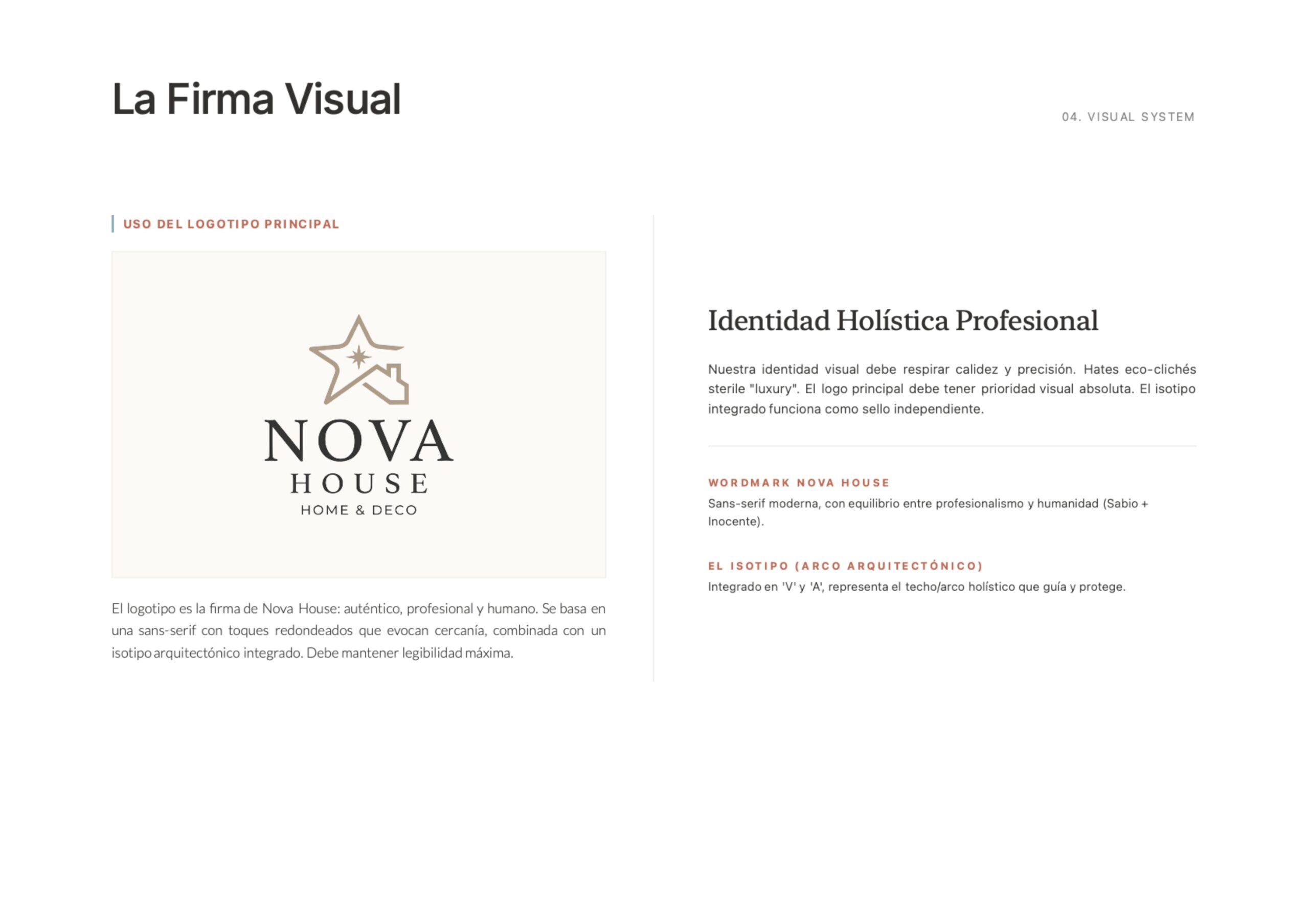
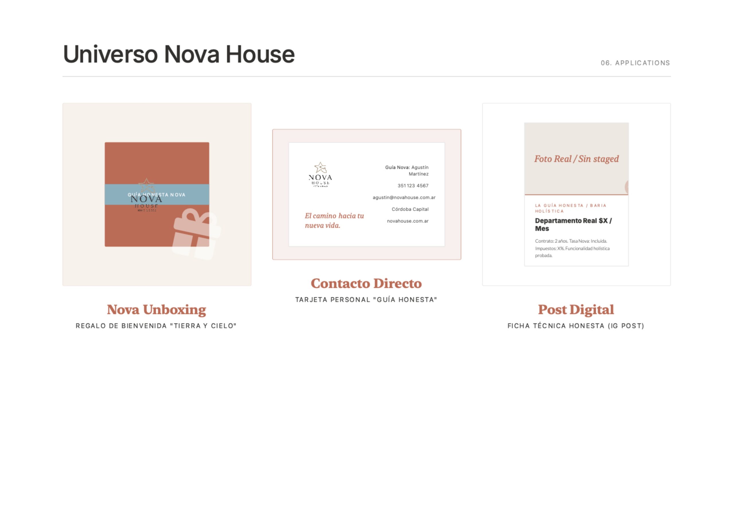
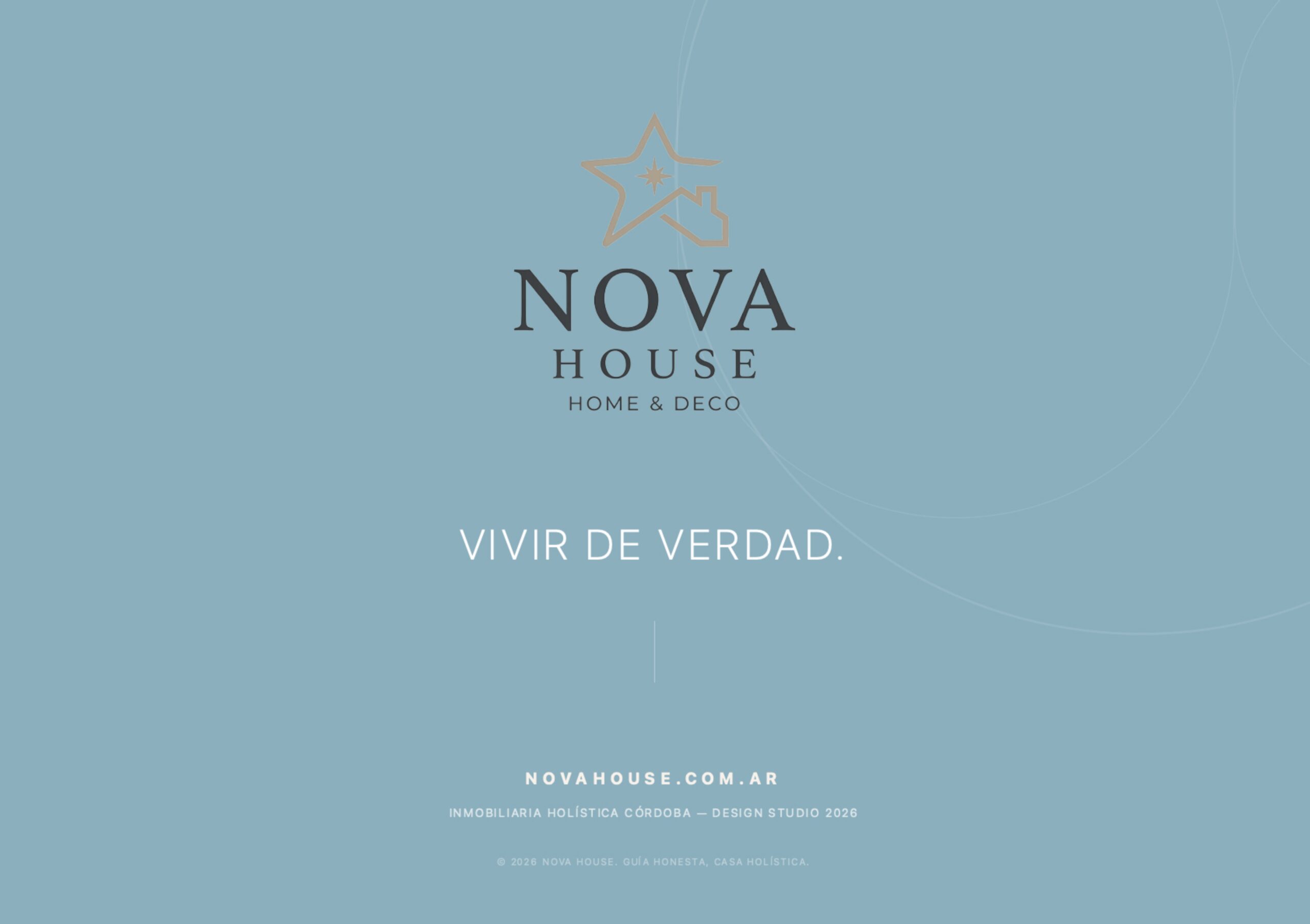
Visual and verbal identity for a holistic real estate agency focused on transparency and functionality.
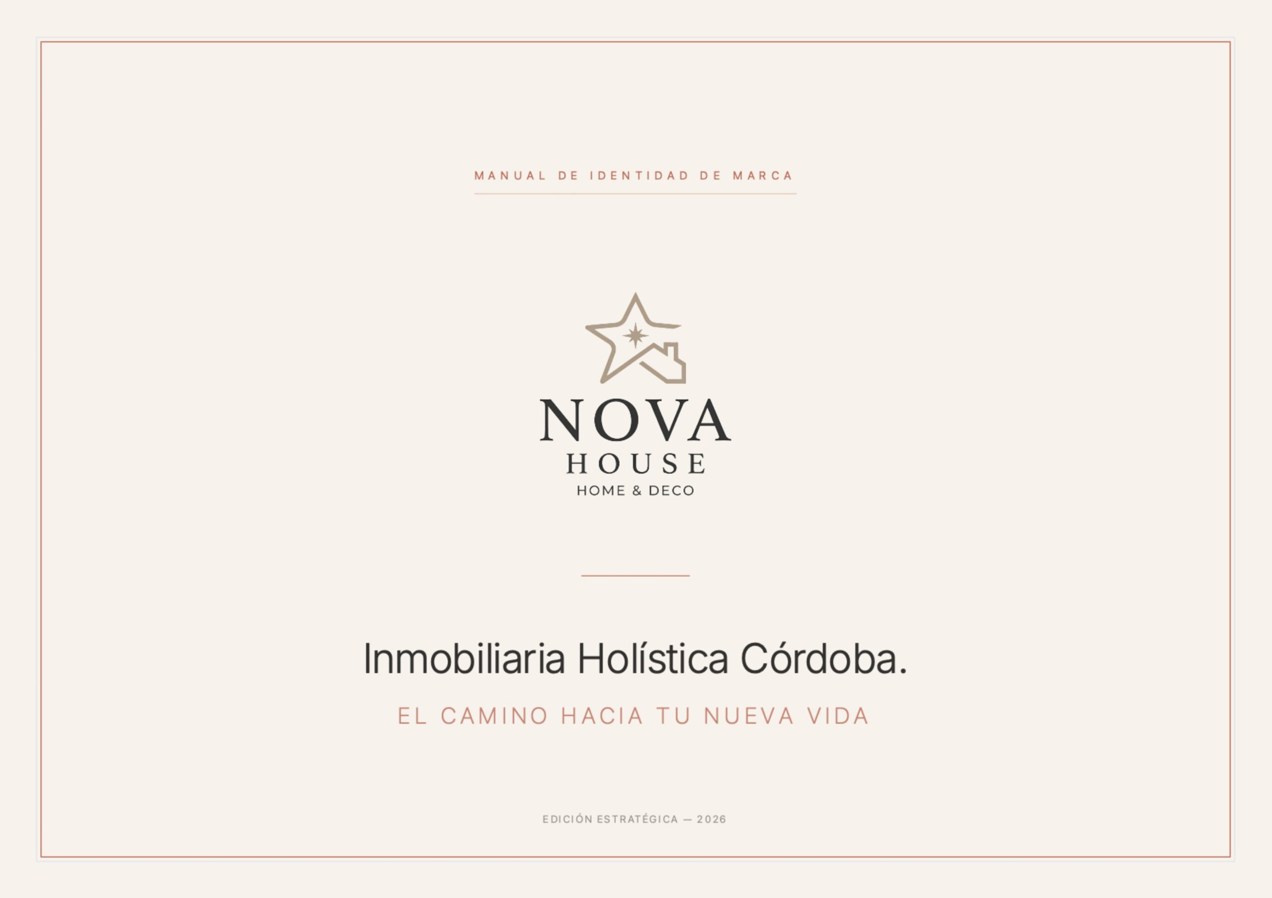
An architectural symbol was embedded in the letters 'V' and 'A' of the wordmark to represent a guiding arch or roof.
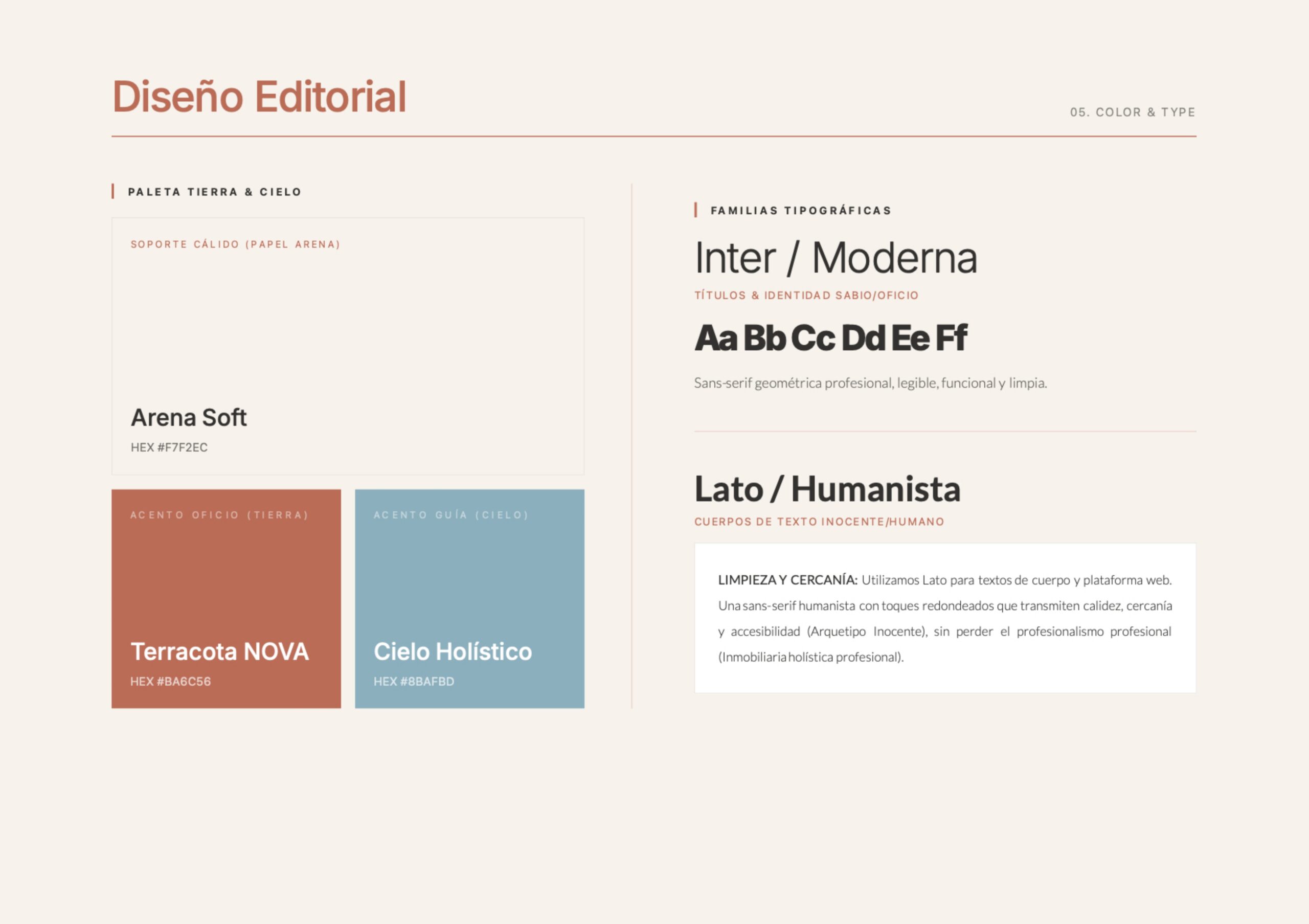
The geometric Inter typeface was used for headlines to ensure a professional tone, paired with the humanist Lato for body text to convey warmth and approachability.
A color palette named "Tierra & Cielo" (Earth & Sky) was implemented, using warm tones like Arena Soft and Terracotta to move away from the sterile real estate aesthetic.
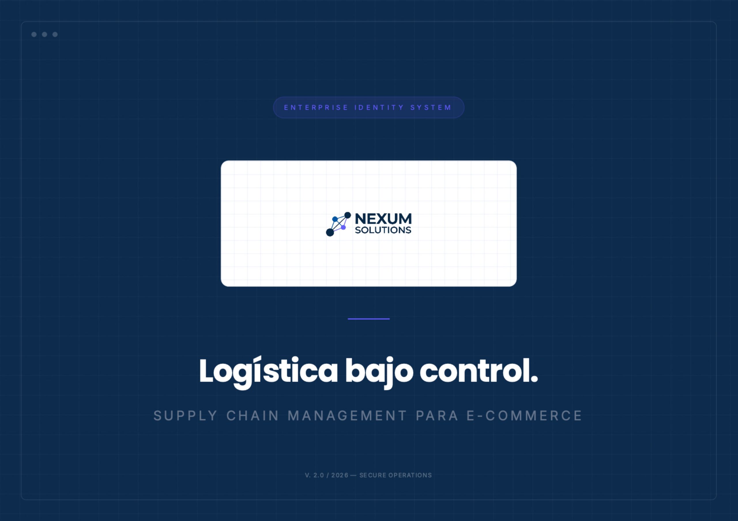
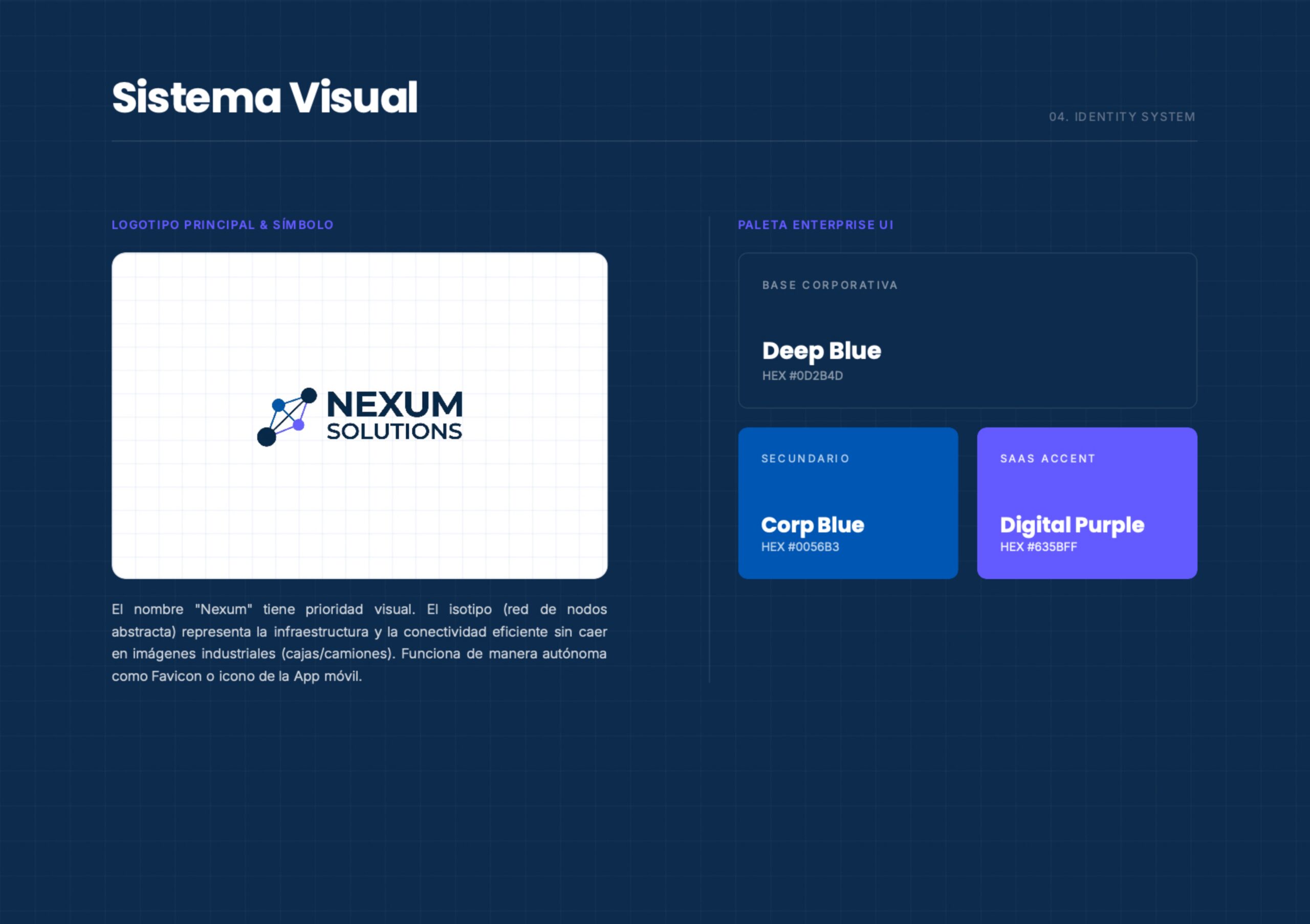
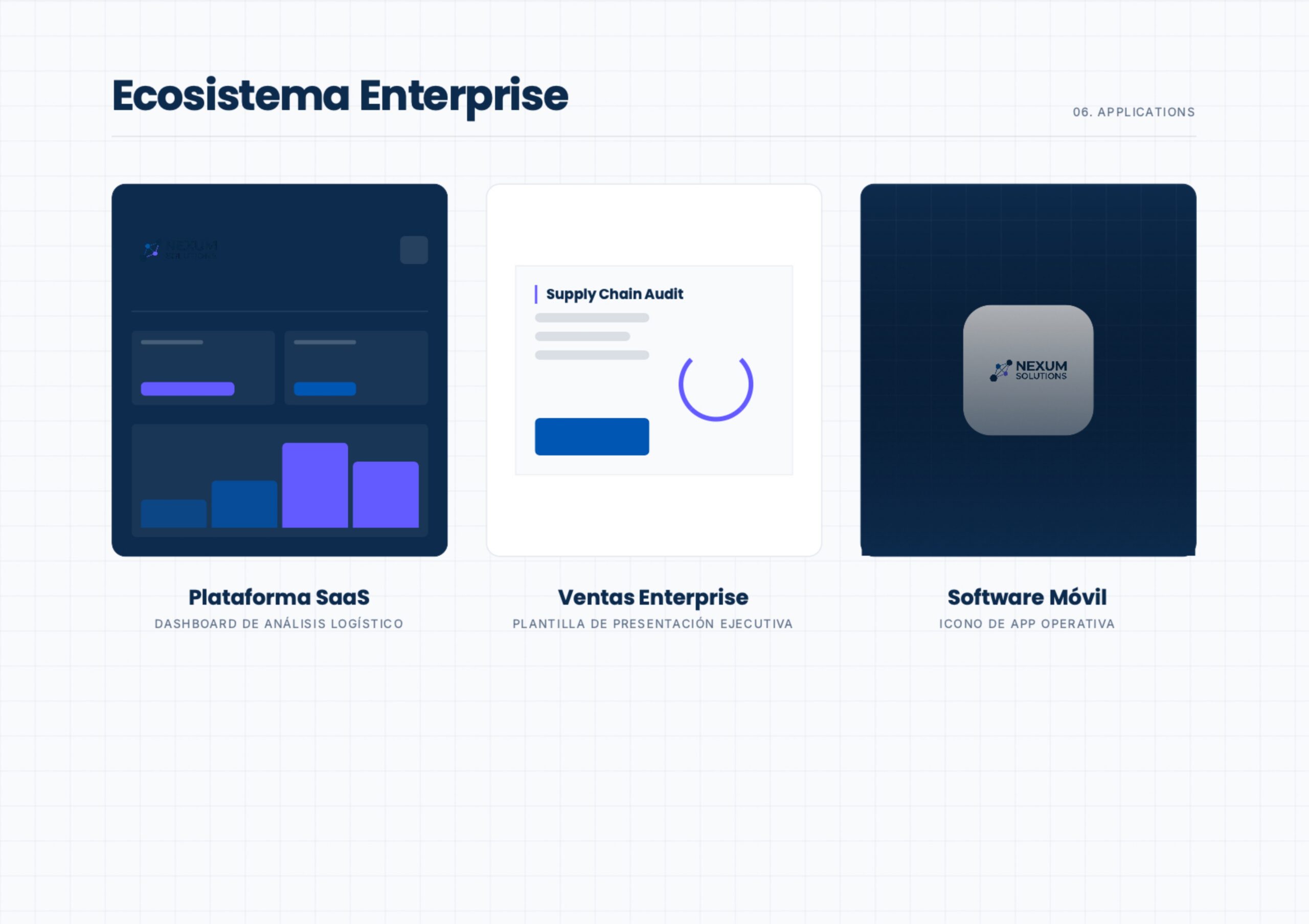
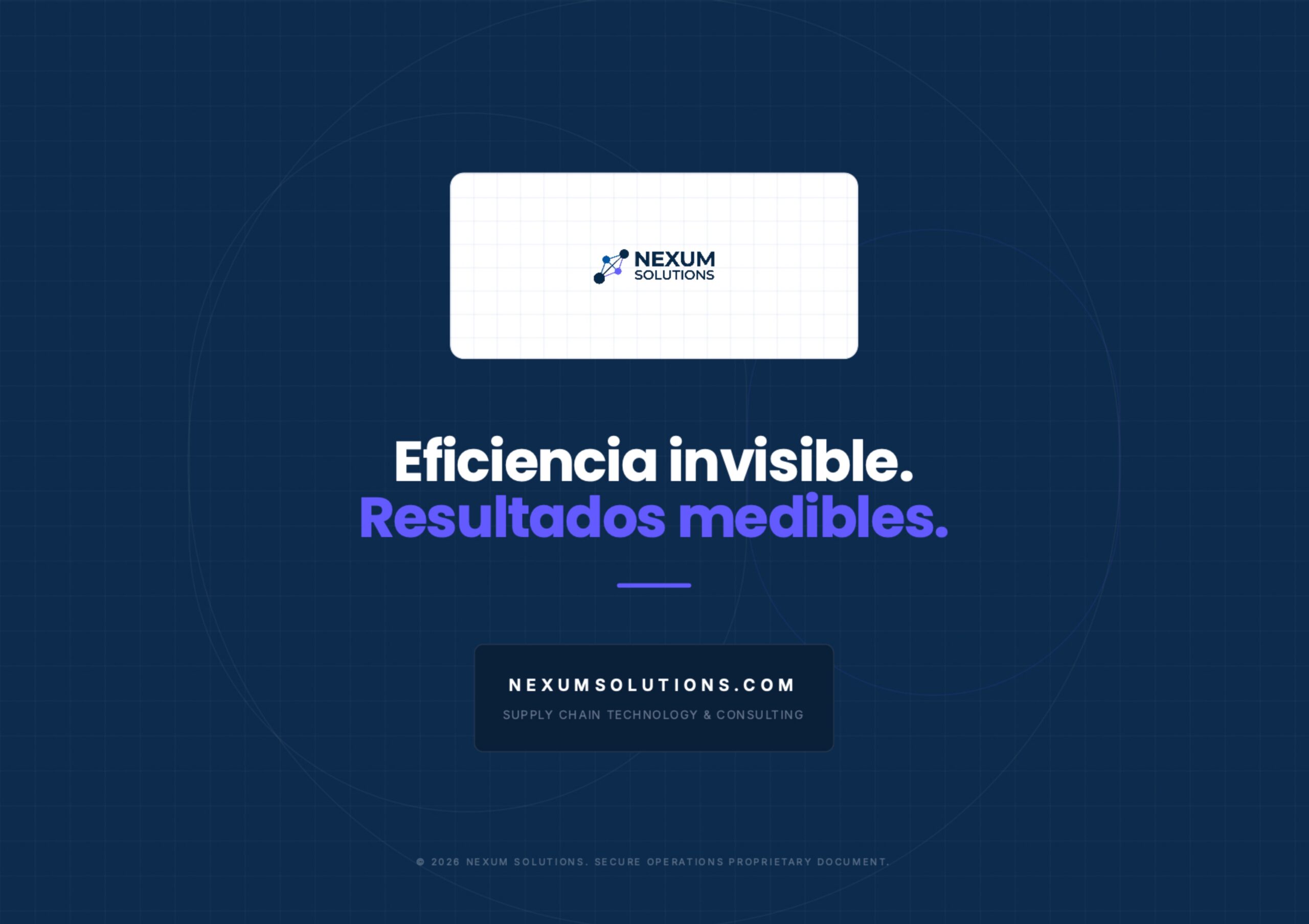
Corporate identity system and UI for an enterprise logistics SaaS provider.
Any literal industrial imagery (boxes, trucks) was replaced with an abstract node network communicating data infrastructure and efficient connectivity.
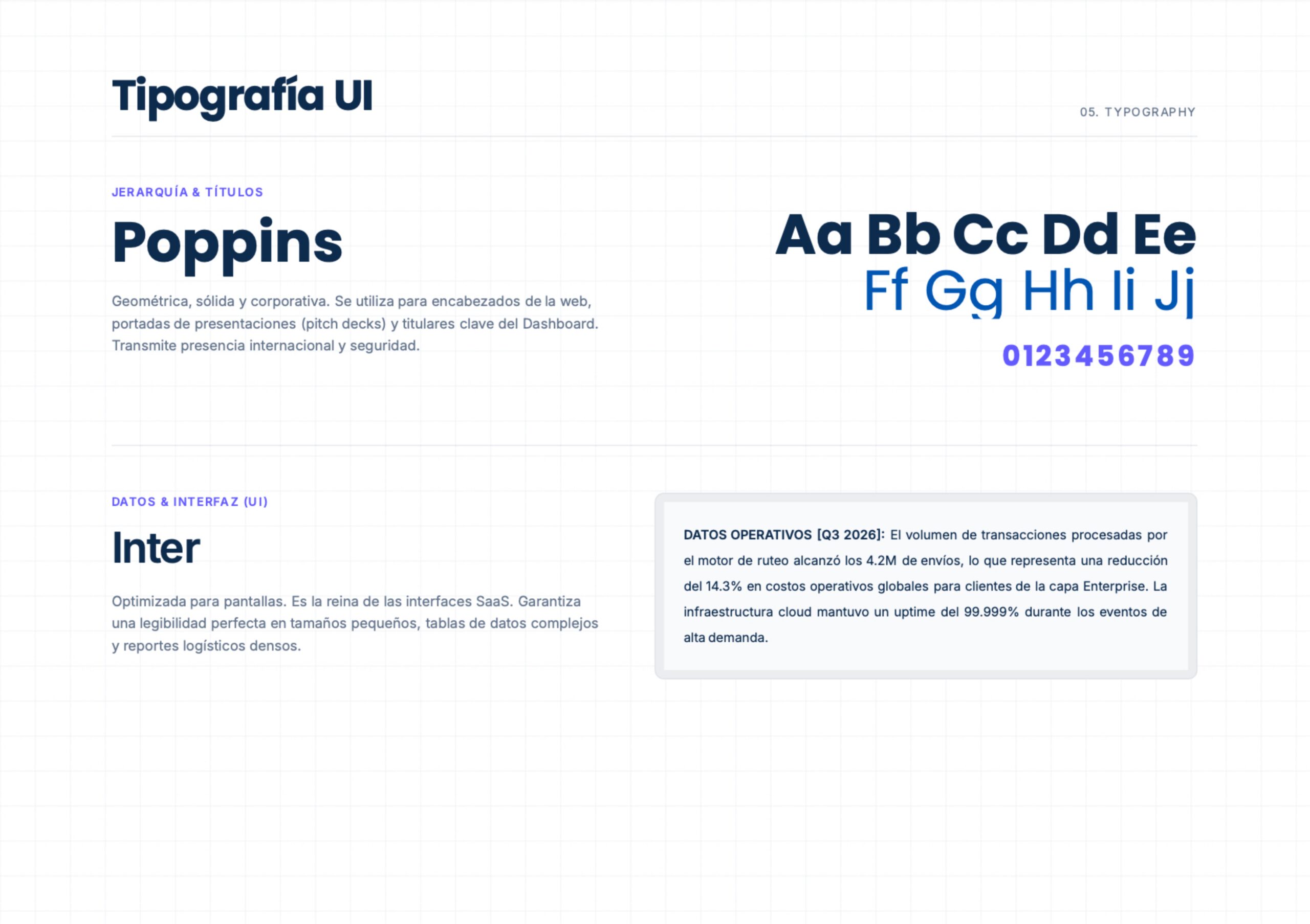
The Inter typeface family was selected to ensure perfect legibility across complex interfaces, data tables, and dense logistics reports.
A corporate palette anchored in deep blues was structured, incorporating a "Digital Purple" accent reserved exclusively for the SaaS interface layer.
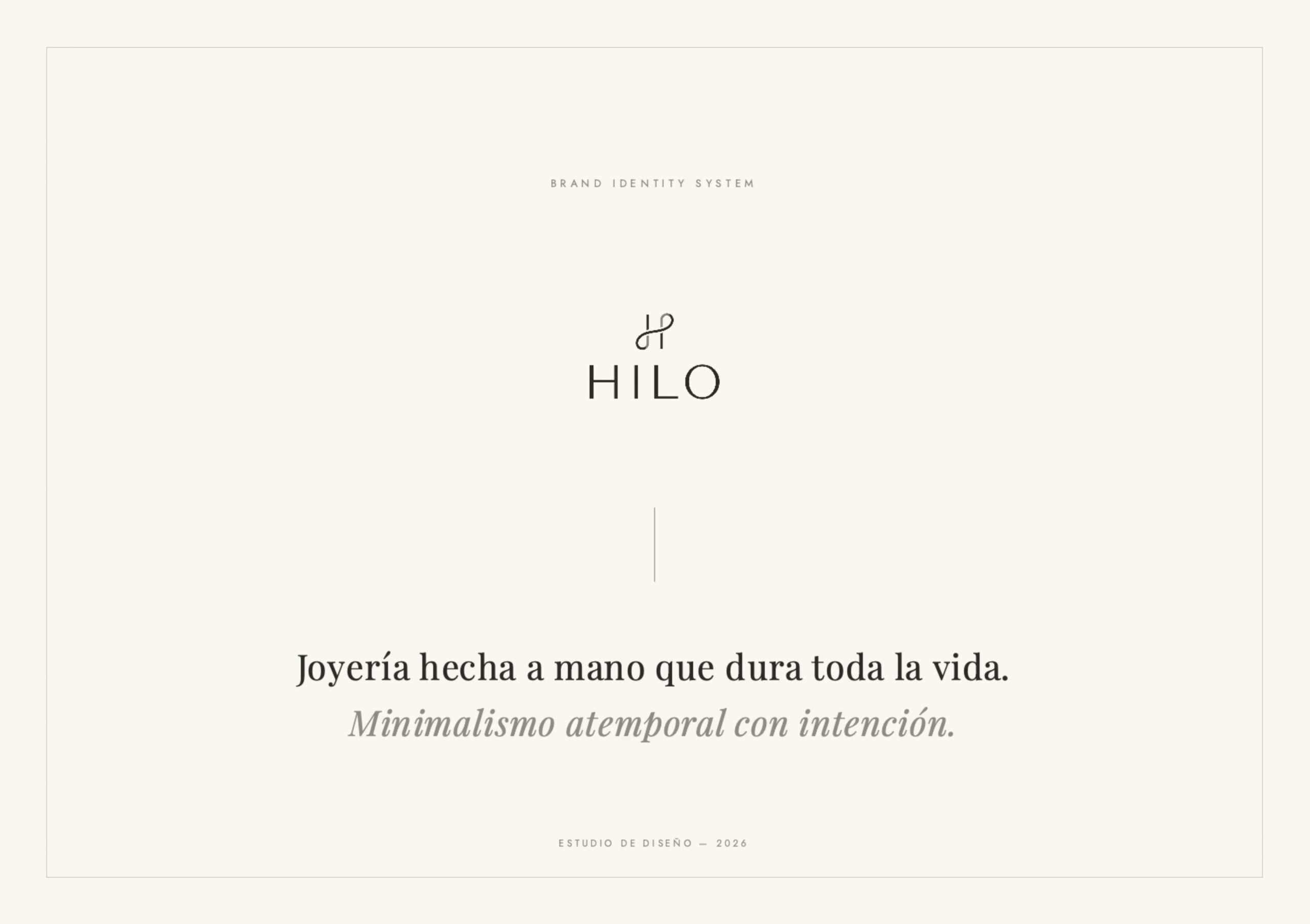
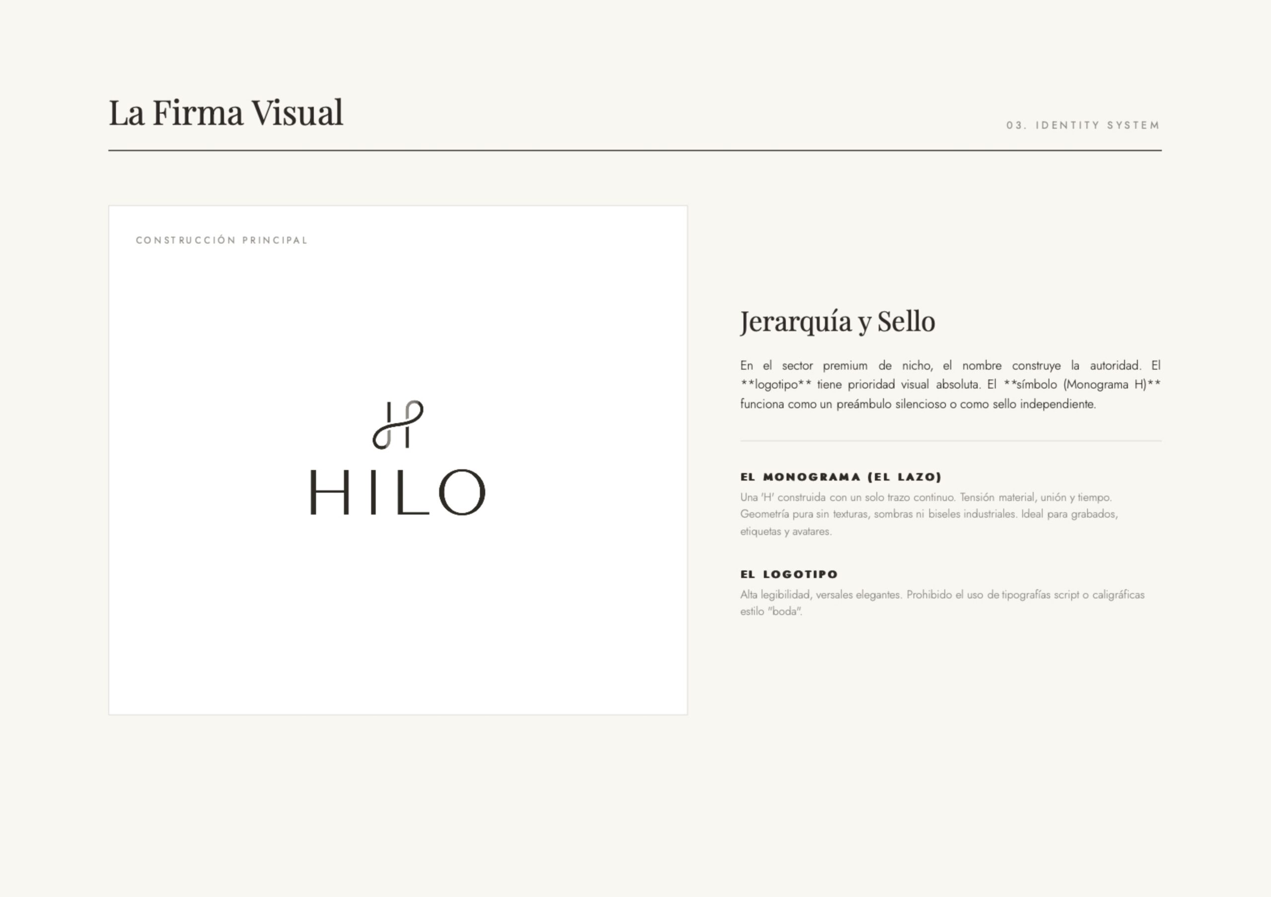
Identity system for an artisan jewelry brand rooted in timeless minimalism.
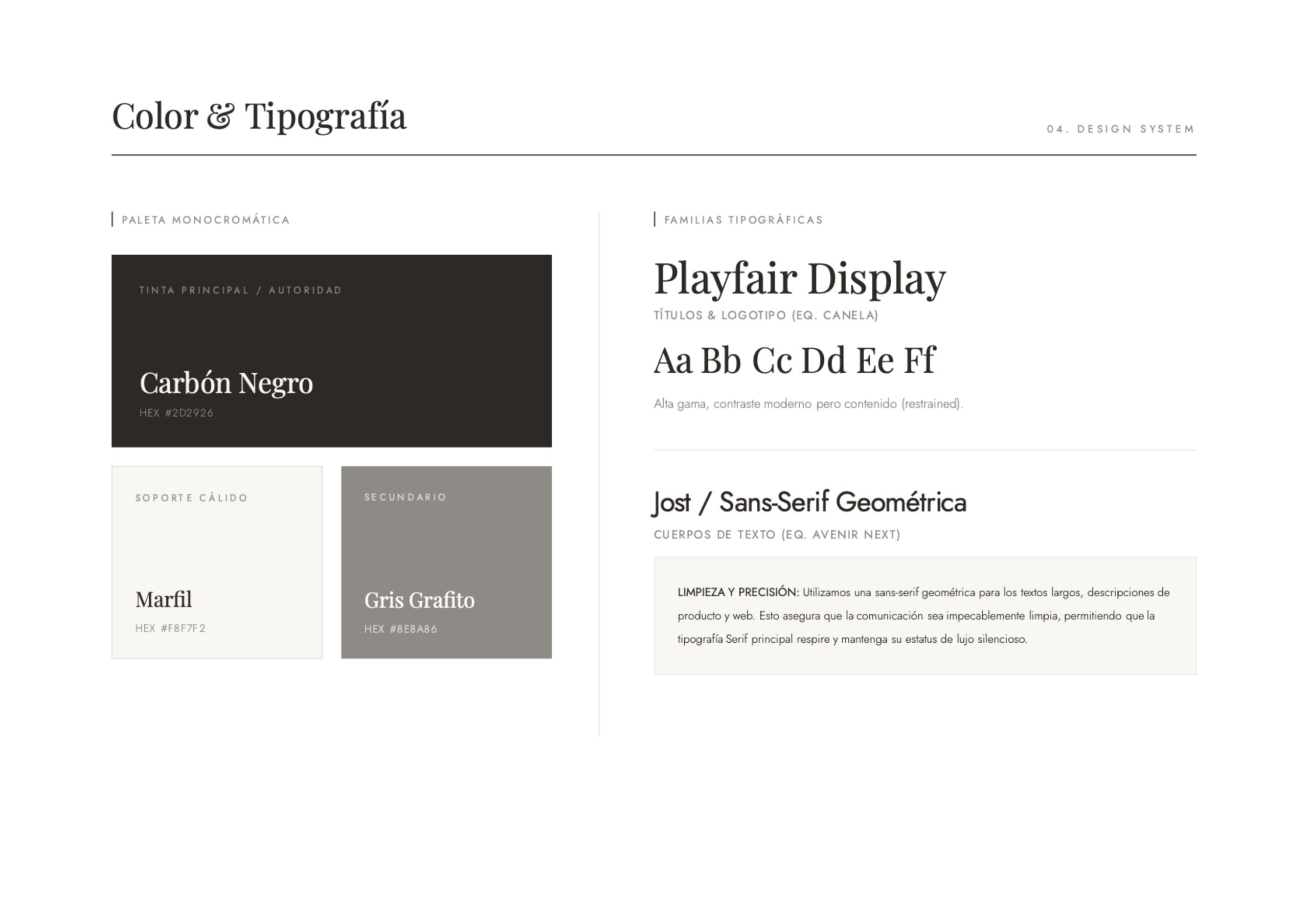
The "workshop diary" or craft aesthetic was deliberately banished, building a mature, quiet monochromatic system (Charcoal Black, Ivory, and Graphite Grey).
To maintain premium brand positioning, the use of script or calligraphic "wedding" typefaces in the logotype was explicitly prohibited.
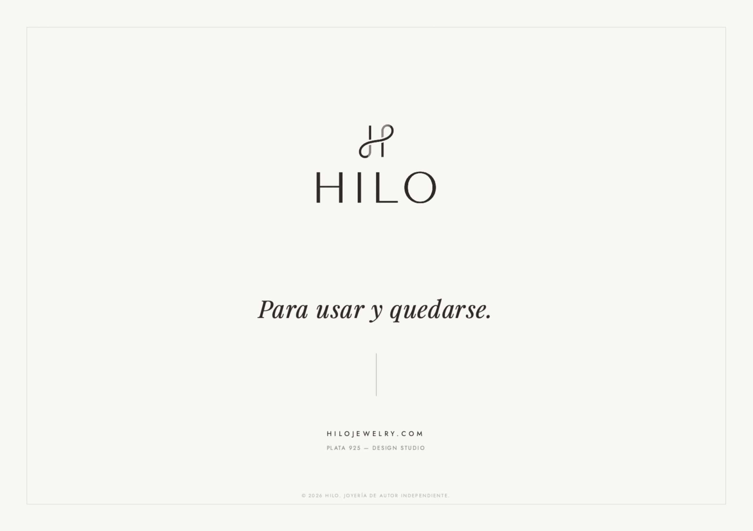
The symbol (the letter H) was drawn using a single continuous stroke of pure geometry, expressly prohibiting textures, shadows, or industrial bevels.